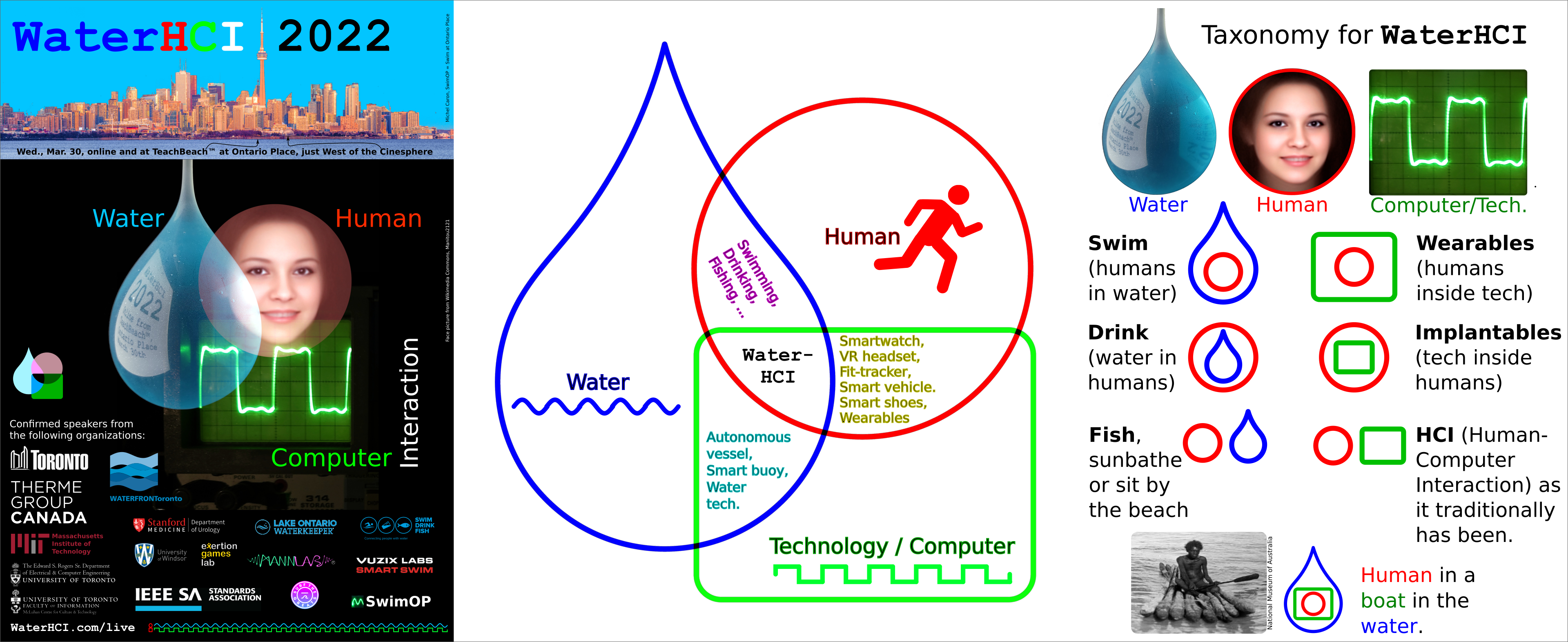
Evolution of our logo:
Our early DECONference logos (c. 1998) were based on a circle and square to represent the human mind-and-body or the humachine (human and machine), and a sinewave to represent water, and a square wave to represent technology.DECONference 2021 was based on 3 intersecting circles, blue for water, red for human, and green for technology (color of early computer displays, circuitboards, etc.). The three circles formed the basis of the Mattson-Mann taxonomy/ontology (Swim/Drink/Fish, etc.). [Proceedings, Page 7].
DECONference 2022 saw this migrate to three distinct shapes to improve
accessibility to those with impaired color vision. We now have a distinct
blue drop, red circle, and green rectangle to represent water, human, and
technology, respectively:
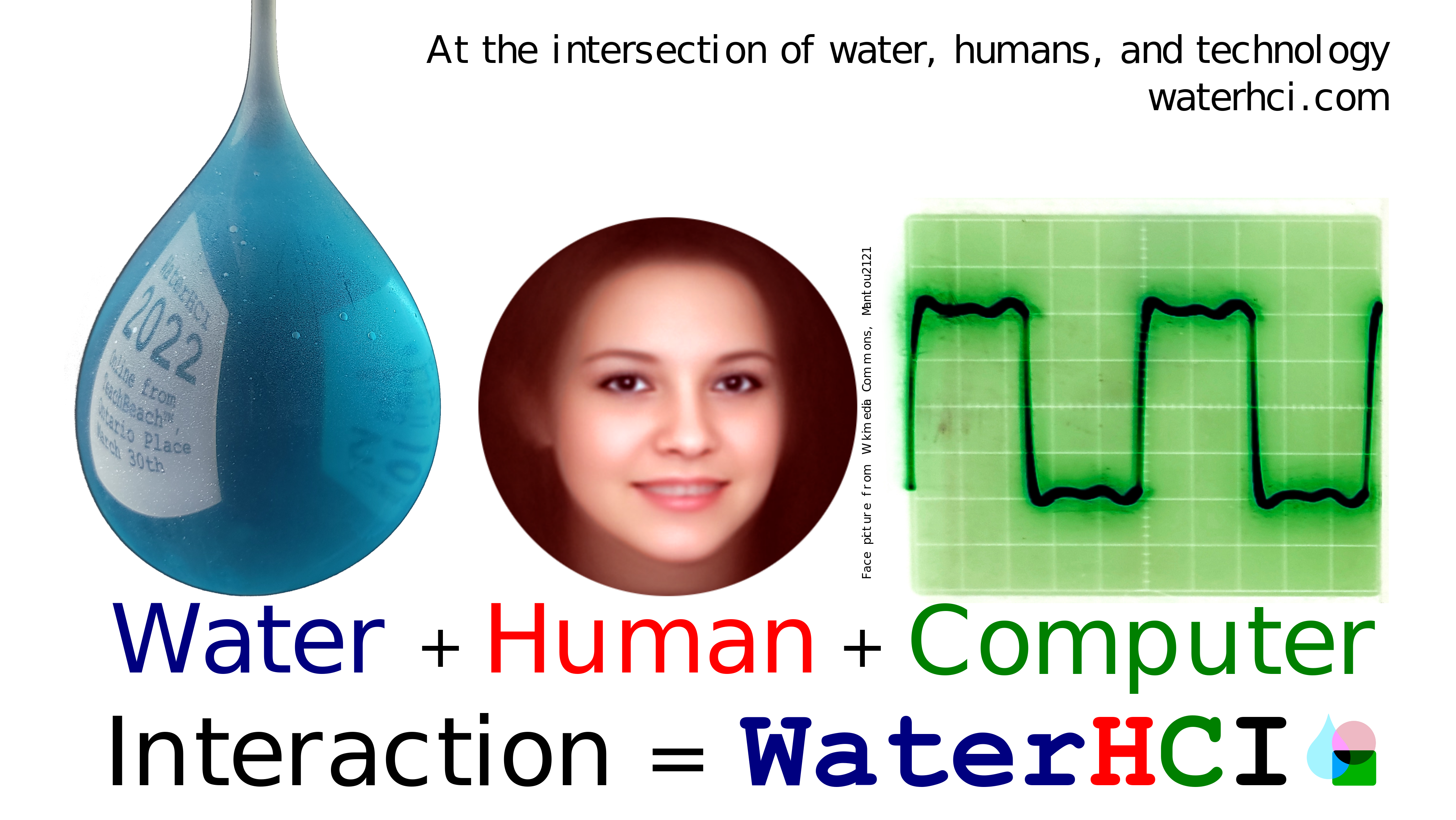
Present-day logo as an aid to the taxonomy/ontology:
The blue drop, red(or reddish) circle, and green rectangle form the taxonomy/ontology/graph elements, as shown rightmost below: